ABOUT
Acecgt group is based in Hong Kong and committed in bringing innovative solution and translating life science's technology into everyday applications. Leveraging on the vest amount of knowledge and know-how derived from Human Genome Projects (HGP), International HapMap Project and other projects, Acecgt is taking this opportunity to translate the science into practice in the fast growing markets covering Hong Kong, China and Asia.
LOGO DESIGN CONCEPT
Acecgt’s group mission is to bring closer to the people the power of life science technology to become healthier individuals and to prolong individuals’ healthy life expectancies. They are very into DNA and technology, so that it’s reflected in their name Acecgt [pronounced as A,C,G,T]. As we all know, A, C, G and T are the essential building blocks of DNA and it holds many secrets of life.
Hexagonal shape is used as the basic element of the logo, it represents their business model is built upon the spectrum of six technology areas - (1) Stem cell regeneration biology, (2) Personalized and preventive medicine, (3) Medical molecular diagnosis, (4) Individualized diets, (5) Health and wellness, (6) Healthcare technology. Designing with negative space, the entire graphic of “ace” is visually connected by the silhouette of DNA helix.

VISUAL IDENTITY


Colour Scheme: Management Team (Virtual Pink) | Technical Team (Riviera) | Marketing Team (Magenta Haze)
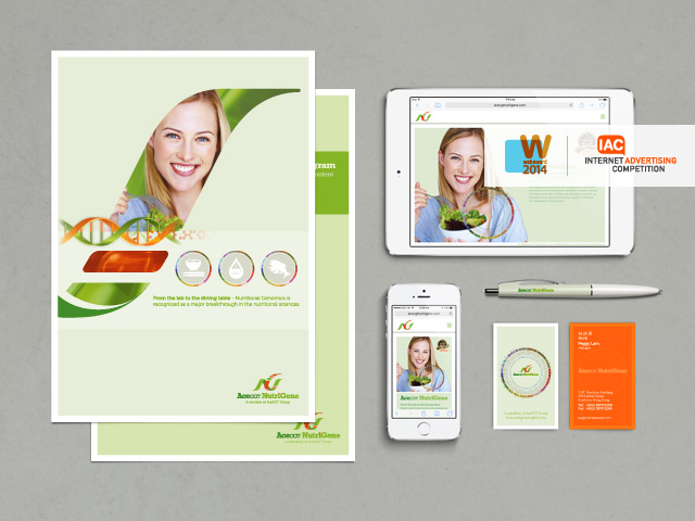
COLLATERAL DESIGN

Letter "a" will change to "6" when flip-over : Acecgt's business model is built upon the spectrum of six technology areas.

Corporate infographic flyer

Corporate brochure


OFFICIAL WEBSITE


