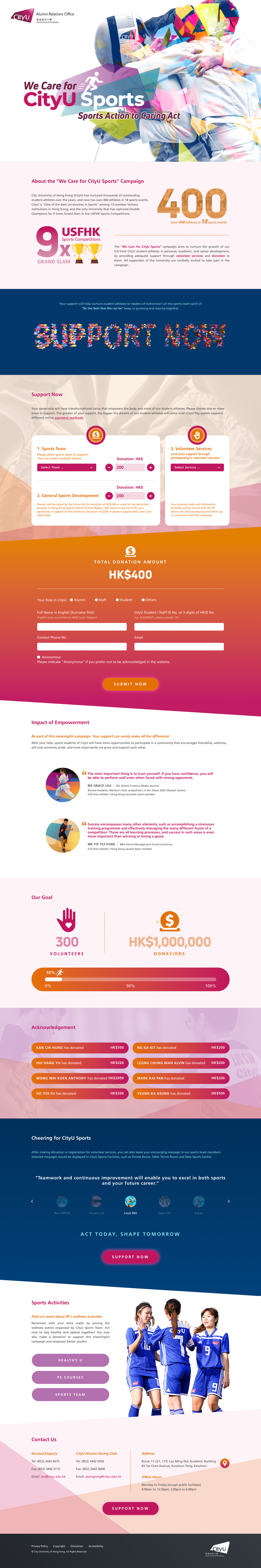
//// SharpMotion :: Portfolio - We Care for CityU Sports

We Care for CityU Sports

Website Design

ABOUT

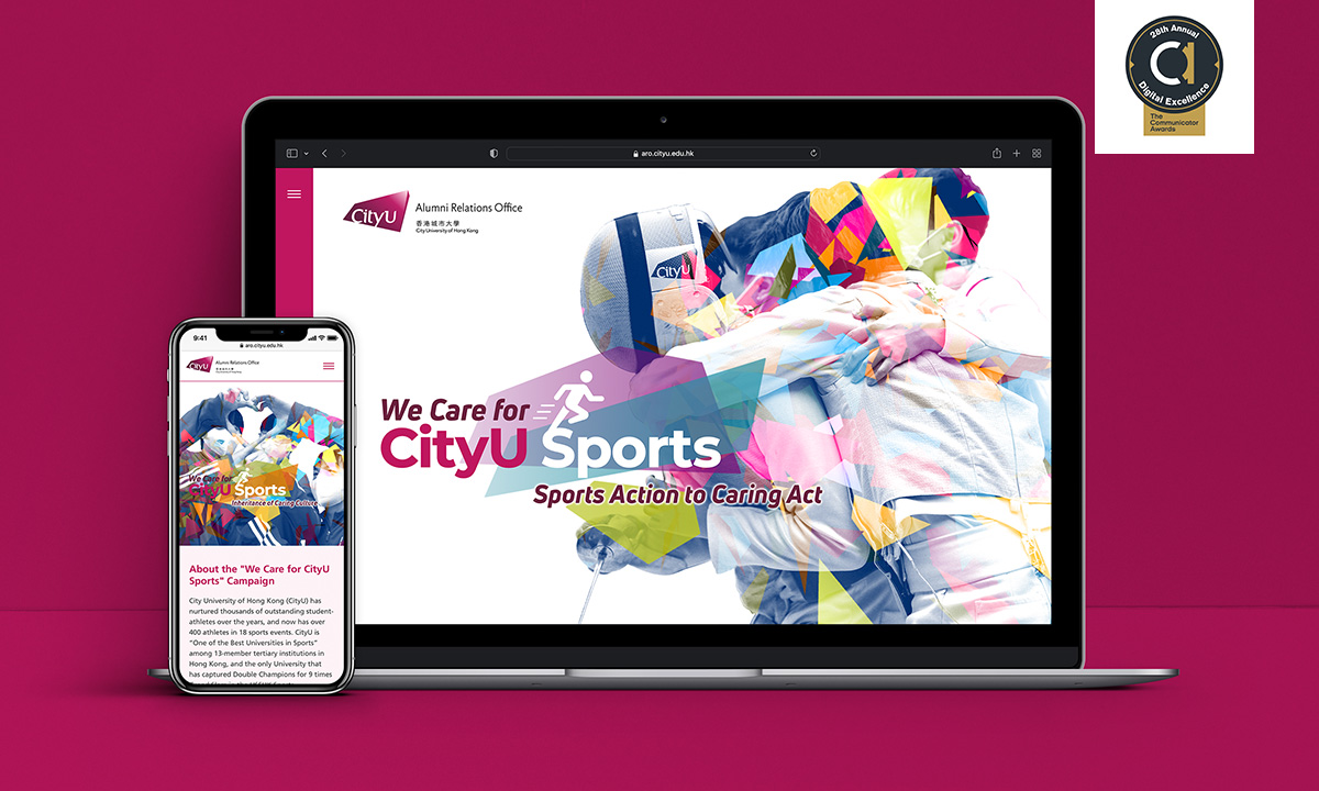
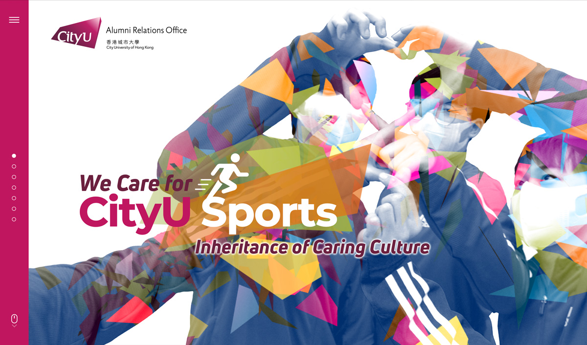
City University of Hong Kong (CityU) has nurtured thousands of outstanding student-athletes over the years, and now has over 400 athletes in 18 sports events. CityU is “One of the Best Universities in Sports” among 13-member tertiary institutions in Hong Kong, and the only University that has captured Double Champions for 9 times Grand Slam in the USFHK Sports Competitions.

The “We Care for CityU Sports” campaign aims to nurture the growth of their full-time CityU student-athletes in personal, academic, and career development, by providing adequate support through volunteer services and donation to them. All supporters of the University are cordially invited to take part in the campaign.

DESIGN CONCEPT

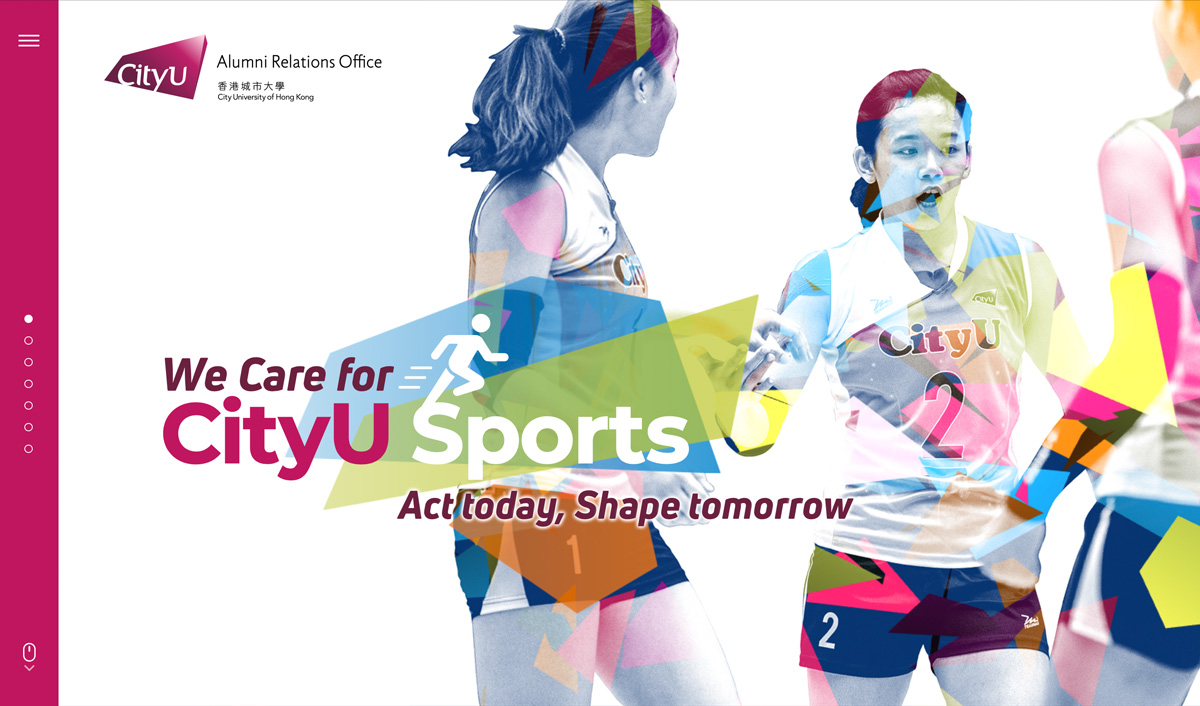
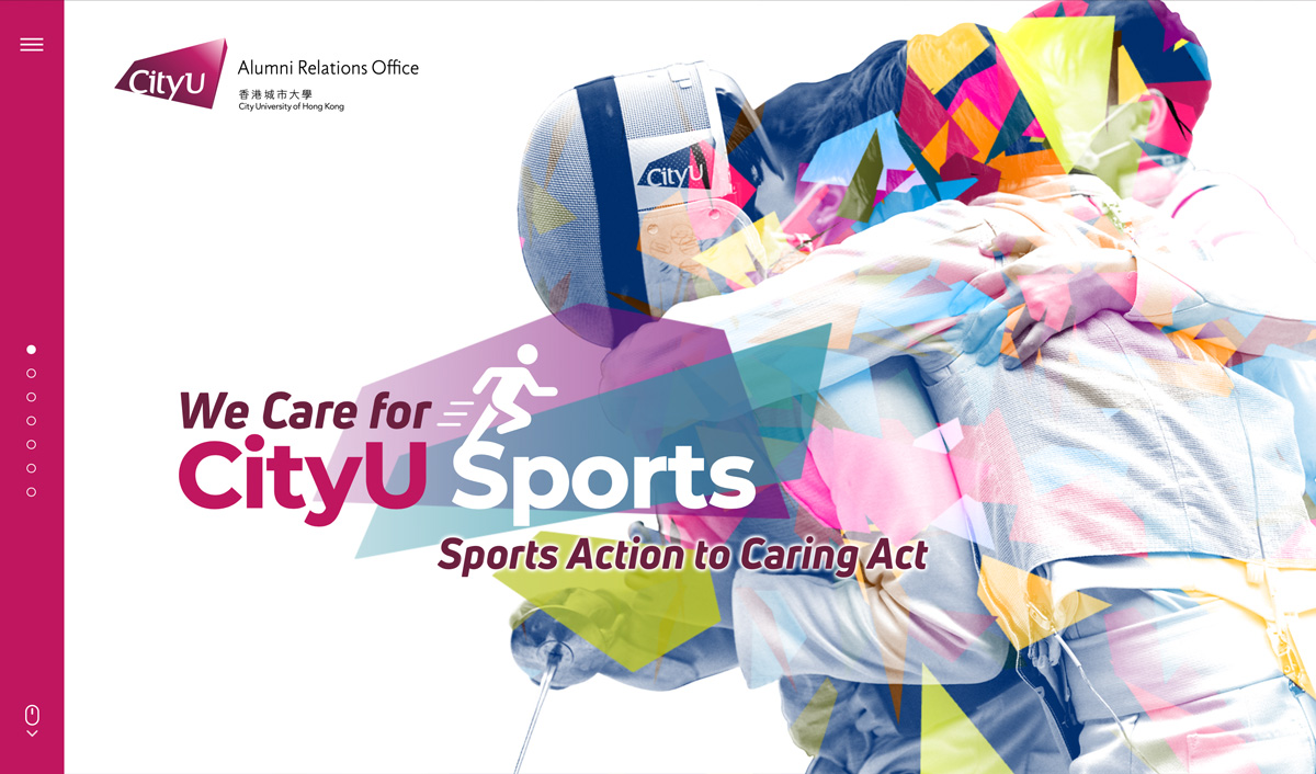
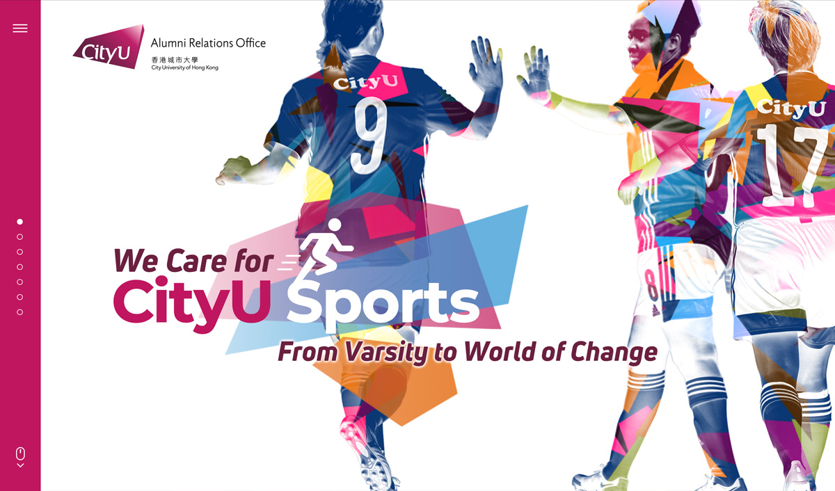
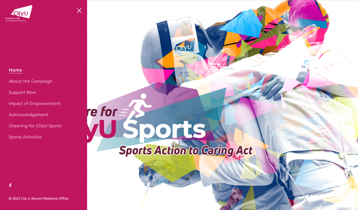
The motif of “three.js” animation is inspired by the polygon of CityU logo element, with a vibrant colour scheme adapted from the corporate identity system. The motion graphics create a visual metaphor of “Converging the dynamic of sports teams” as well as the connotation of “Every little makes a mickle”. Finally, it illustrates an objective of encouraging the myriad alumni to continually support the student-athletes through donations and volunteer services.

//// SharpMotion :: Portfolio - Jack's Veterinary

Jack's Veterinary

Visual Identity

ABOUT

Jack’s Veterinary is a team composed of veterinary surgeons and veterinary nurses. Seeing the many opinions and scattered and unverified information about pet care on the internet which may confuse owners, Jack’s Veterinary was set up which aims at providing better quality of life and health for our animals. The core value is to provide an online veterinary service and share the knowledge and information of pet care with the public. Apart from offering members the online veterinary service, they also devote their effort on organizing different activities and interest groups.

LOGO DESIGN CONCEPT

The logo design is based on the graphical manipulation of a Jack’s poker face, which combines the silhouettes of those 4 major classes of animals - cat/dog, rabbit (small mammal), chameleon (reptile) and bird. The visual is embraced by a form of shield as the metaphor of protection and prevention dedicated to the animals.

VISUAL IDENTITY

OFFICIAL WEBSITE

//// SharpMotion :: Portfolio - Acecgt NutriGene

Acecgt NutriGene

Corporate Visual Identity

ABOUT

From the lab to the dining table - Nutritional Genomics is recognized as a major breakthrough in the nutritional sciences. Nutrigenetics is a branch of nutritional genomics which aims to identify genetic susceptibility to diseases and genetic variation in the effects of nutrient intake on the genome.

Acecgt NutriGene (ANG) is established for investigating individual genetic differences that can affect the way individual responses to diet and nutrients. This exciting new frontier offers tremendous promise through a proactive approach, by making recommendation on personalizing the diet and lifestyle factors based on your own genetic profile.

We've been invited to create a full set of corporate visual identity for this brand new biotechnology company.

LOGO DESIGN CONCEPT

The shape of the logo is basically formed by the letters - "A", "N" and "G". The "A" & "N" are combined and modified as the form of strand of human DNA helix, whereas the metaphor of "identifying genetic issue regarding nutrient intake" is visually expressed by the intersection of the curve of "G" with the diagonal stroke of "N". The orange stripe implies the identified substance that affecting the genome.

VISUAL IDENTITY

COLLATERAL DESIGN

OFFICIAL WEBSITE

We've created a fully responsive and mobile-friendly website with minimal UI design - The biotechnological knowledge is intuitively presented to the target audience through the help of interactive scrollable animation effects and bold infographics, that offers an immersive experience which facilitate the online marketing, search engine optimization (SEO), social community building and the analysis of customers' behaviour.


//// SharpMotion :: Portfolio - iBigHealth

iBigHealth

Website UI & Visual Design

ABOUT

Founded by professionals in medical technology and information technology, iBigHealth is committed to creating new values for the premier smart healthcare platform. They believe disease prevention is the first line of defense for in healthcare. By creating a collaborative health data bank, iBigHealth provide real-time health status analyses, health forecasts, and most importantly, alerts on potential health risks. The more the people sharing data in iBigHealth, the greater the value of data. New insights derived from big data will bring a positive change to health autonomy, familial disease prevention and community care, so anyone can safeguard themselves and their loved ones.

//// SharpMotion :: Portfolio - MODA

MODA

App UI & Visual Identity

ABOUT

Within the healthcare industry, there are many different moving parts, with patients, doctors, hospitals, caregivers, and pharmaceutical organizations all looking to achieve the same goal – a better, healthier lifestyle for everyone. Technology has provided a more efficient way of collating important data for personalized healthcare, allowing professionals to work more closely with individuals and resulting in a more cohesive network. This is being dubbed as Healthcare 4.0.

Through the MODA app, subscribers can connect with professional coaches who can learn the intricacies of an individual’s diet and keep track of their daily exercise routine. Quickly accumulate relevant data through the MODA scale and MODA watch, by connecting to the app. Then, by utilizing the MODA app, individuals can easily spend time with professionals to get up-to-date advice without the need to be in the same room, or even the same continent.

DESIGN CONCEPT

The visual identity features an alluringly rendered colour gradient as the main design element; in fact, this vibrant palette is derived from a combination of two natural phenomena - Polar night & Midnight sun, which is the metaphor of unceasing and omnipresent connection between MODA’s subscribers and professionals. Polygon graphic is aptly used as an elegant expression of cohesive network connection as well as the intricacies of big data - diet plans and exercise routines. The letterform "M" extruded with negative space ingeniously depicts the new dimension of advanced healthcare technology.

APP USER INTERFACE


"Login" and "Device Connect" Section


"Dashboard" Screen


"Steps" Section


"Exercise", "Food Journey", "Pro-advice" and "Weight" Section

PROMOTIONAL WEB PAGE