//// SharpMotion :: Portfolio - brother

brother

Official E-Commerce Website

ABOUT

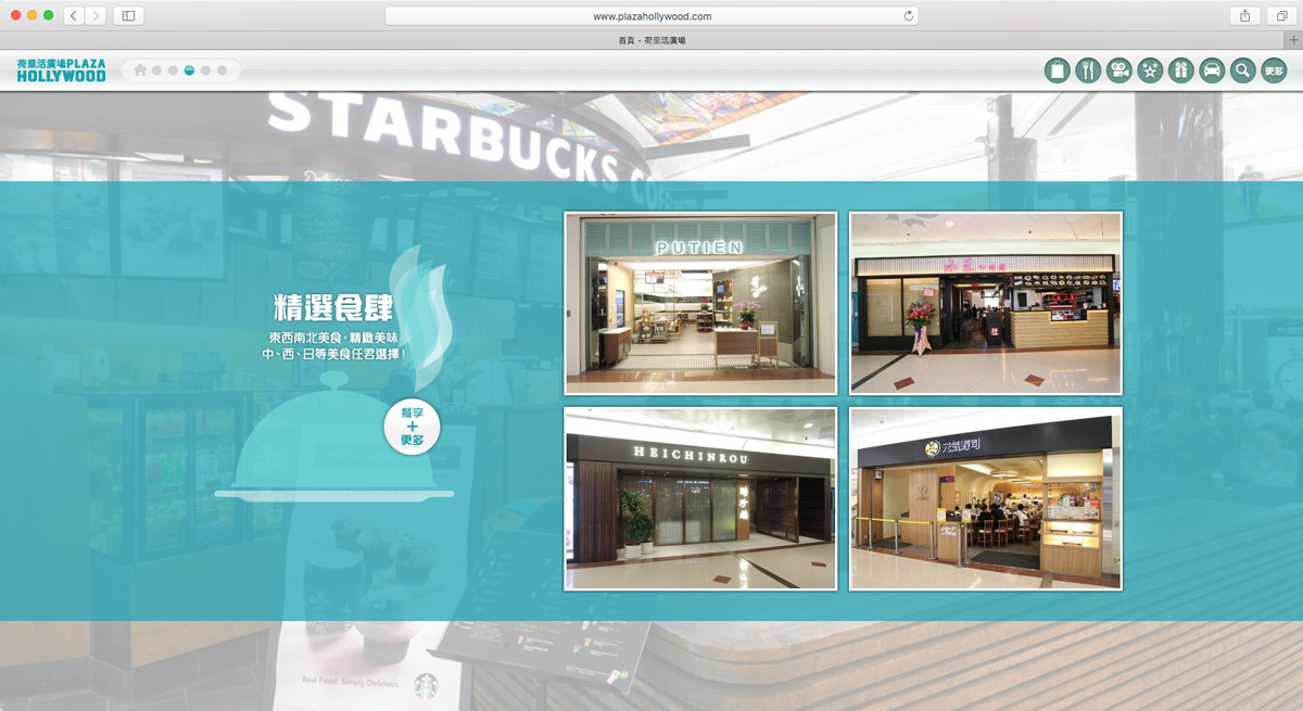
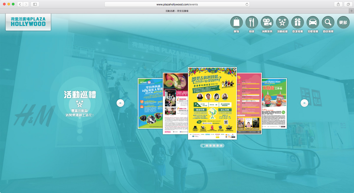
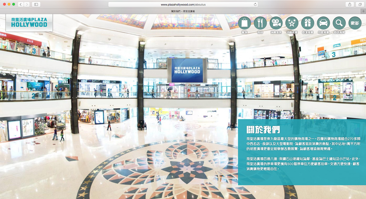
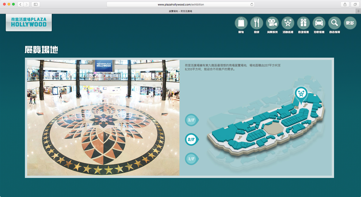
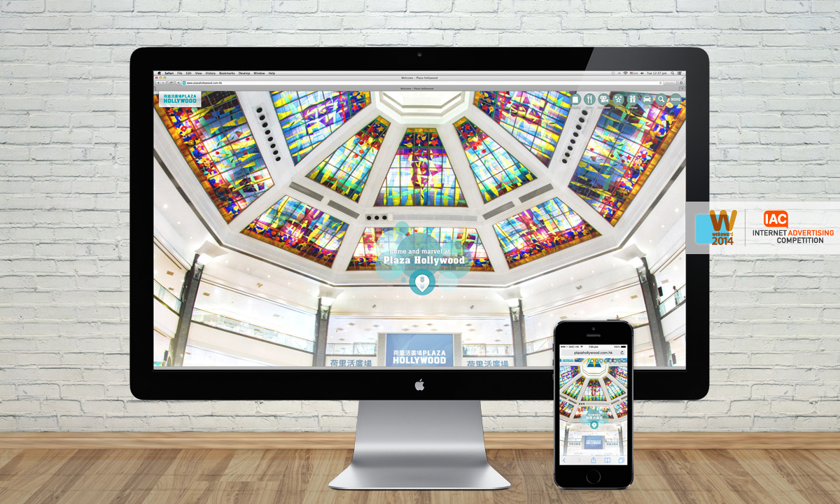
Plaza Hollywood is one of the largest shopping malls in Hong Kong's Kowloon East. It offers an unequalled environment of light and space, a place to shop, relax and enjoy life to the full.
DESIGN THEME

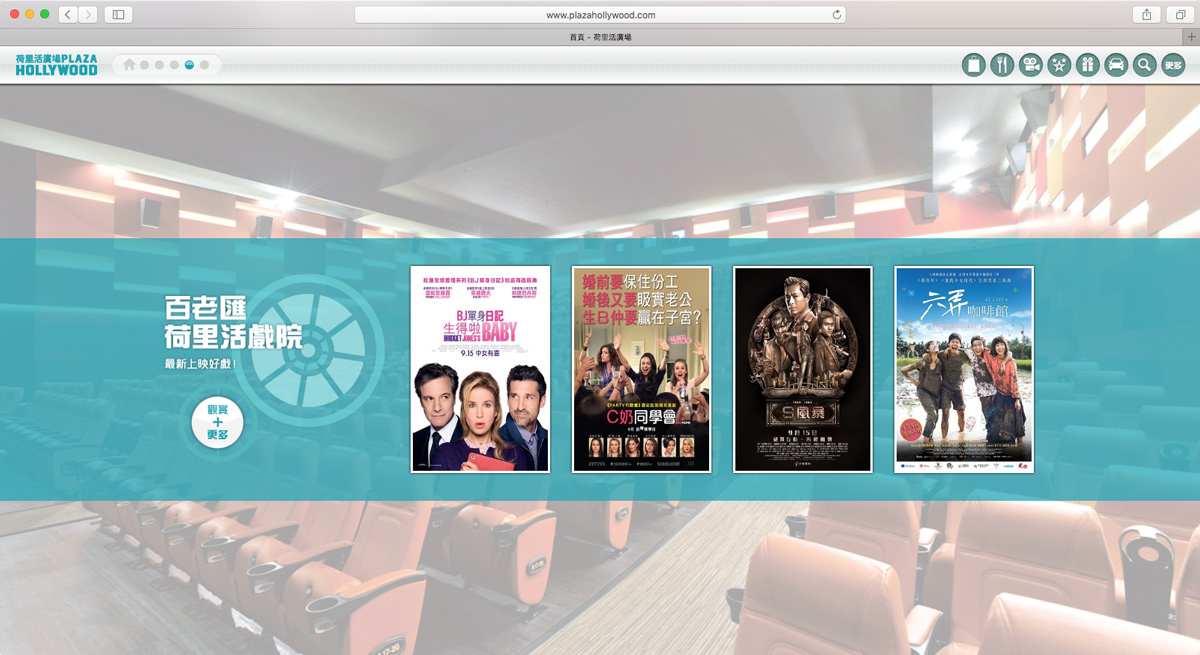
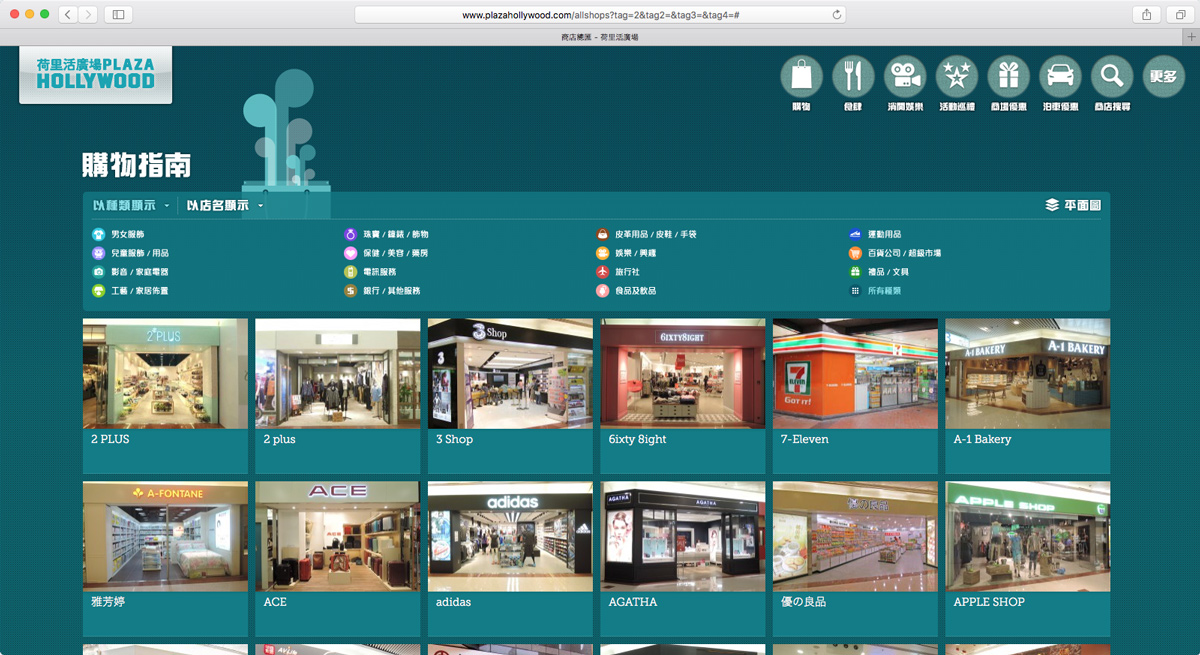
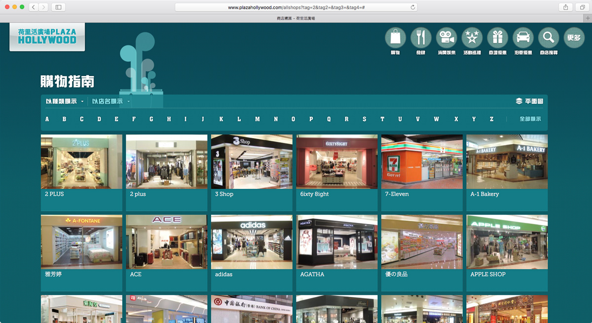
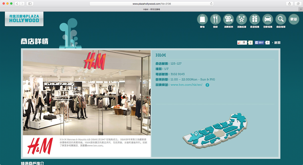
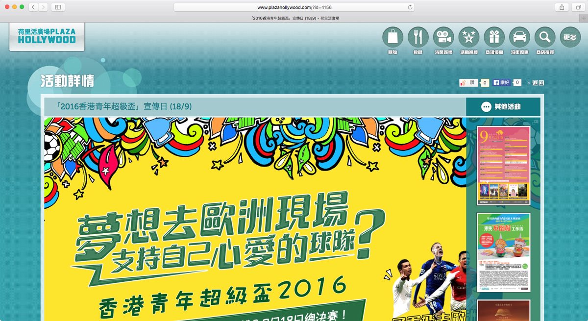
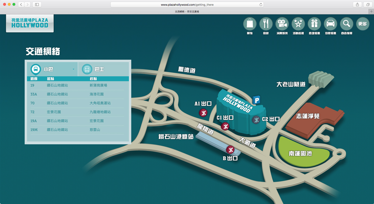
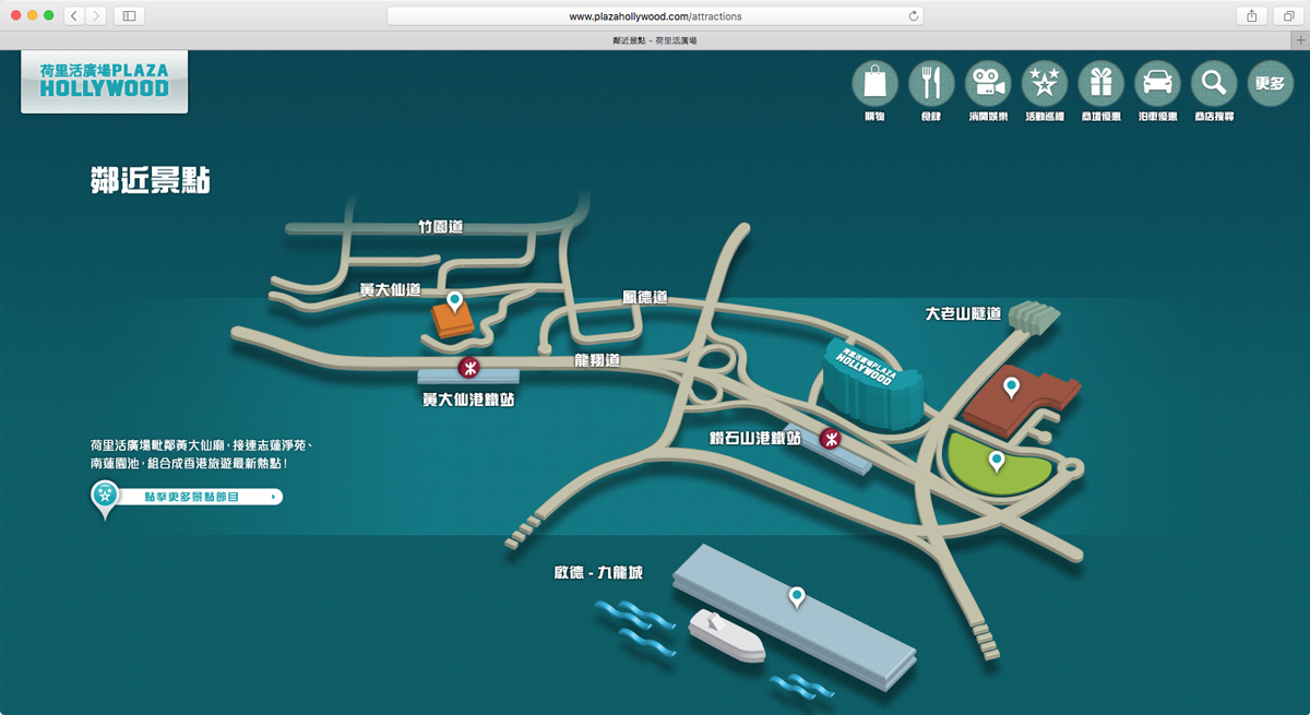
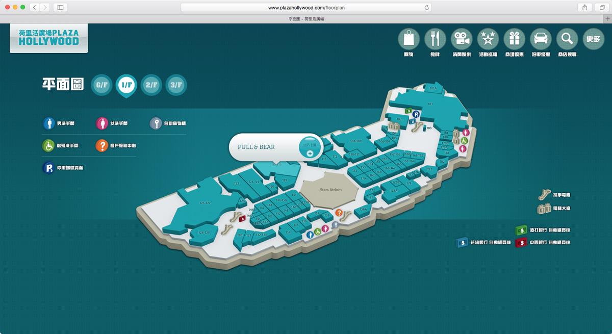
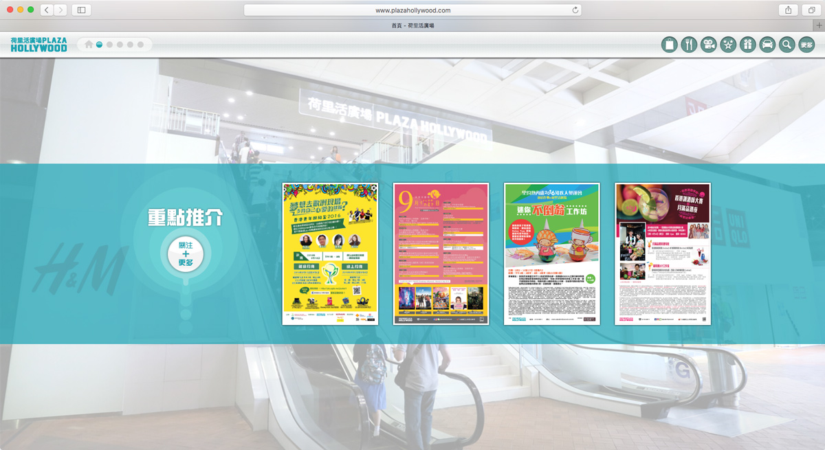
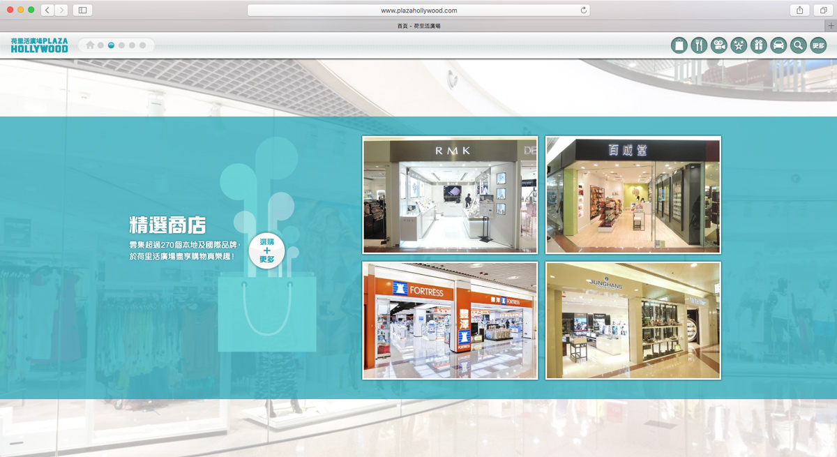
We've revamped the website so as to make it mobile-friendly and responsive to different computer and mobile screen sizes. The design concept is enhanced with the help of latest technologies on animation effects, that offers a one-stop marketing experience with online branding, search engine optimization (SEO), social community building and the analysis of behavior of the online consumer.

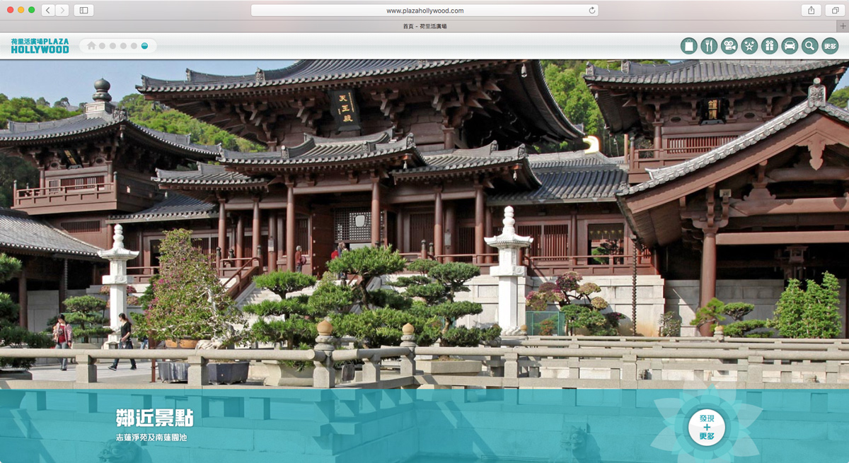
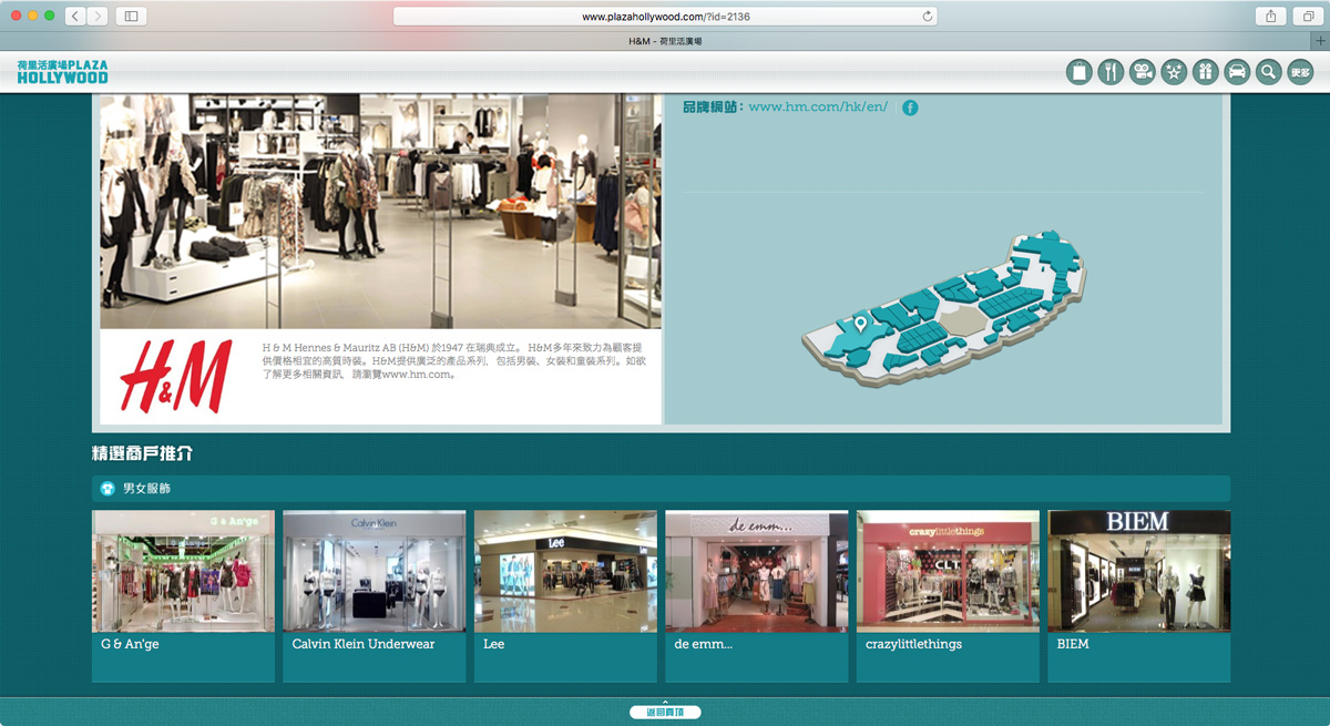
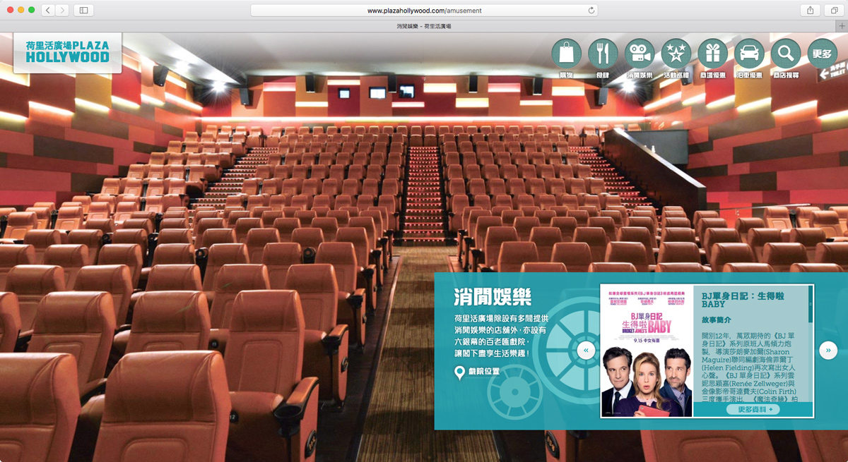
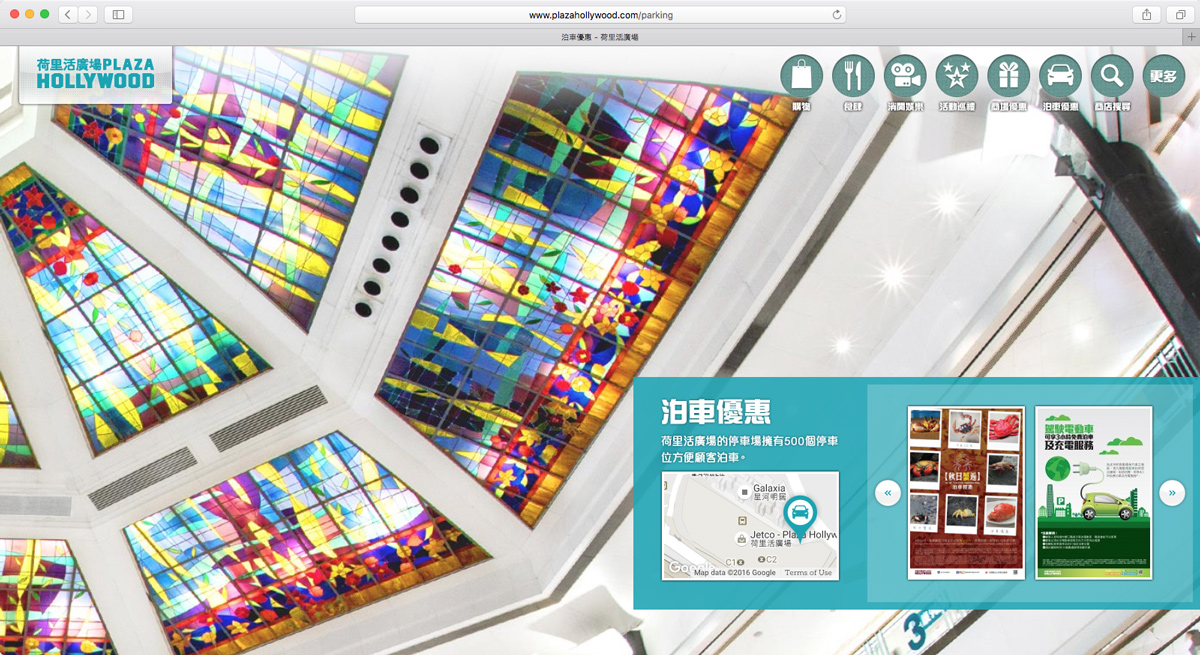
A responsive layout with clean and minimal navigation & grid design, full screen background images are used to create a great visual impact. "Flat-design animated-graphics" is the iconic theme throughout the website.
//// SharpMotion :: Portfolio - iBigHealth

iBigHealth

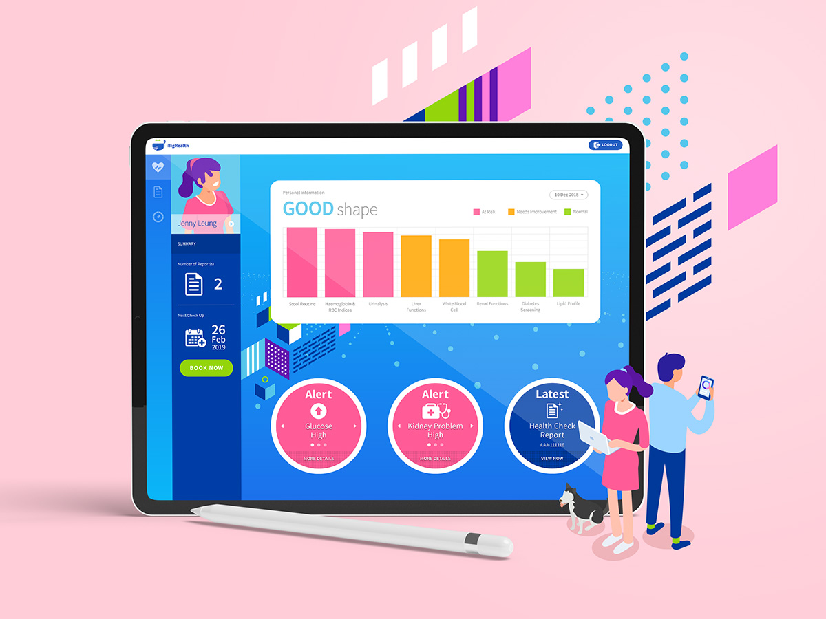
Website UI & Visual Design

ABOUT

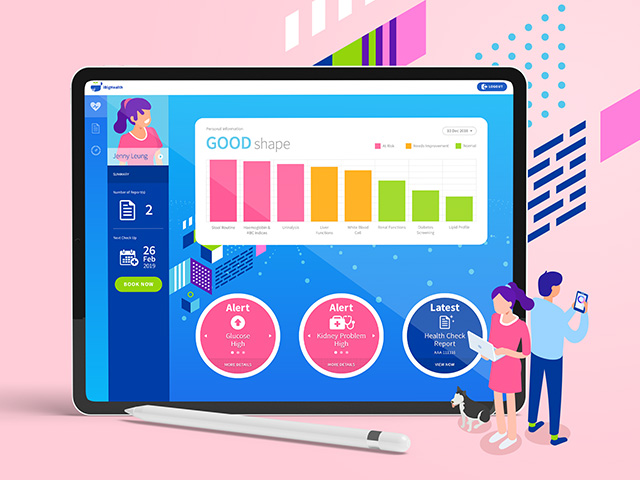
Founded by professionals in medical technology and information technology, iBigHealth is committed to creating new values for the premier smart healthcare platform. They believe disease prevention is the first line of defense for in healthcare. By creating a collaborative health data bank, iBigHealth provide real-time health status analyses, health forecasts, and most importantly, alerts on potential health risks. The more the people sharing data in iBigHealth, the greater the value of data. New insights derived from big data will bring a positive change to health autonomy, familial disease prevention and community care, so anyone can safeguard themselves and their loved ones.

//// SharpMotion :: Portfolio - Acecgt Group

Acecgt Group

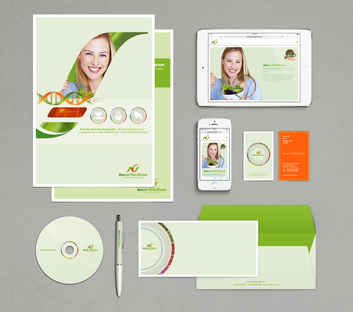
Corporate Visual Identity

ABOUT

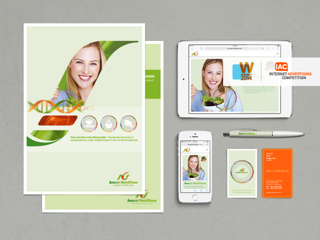
Acecgt group is based in Hong Kong and committed in bringing innovative solution and translating life science's technology into everyday applications. Leveraging on the vest amount of knowledge and know-how derived from Human Genome Projects (HGP), International HapMap Project and other projects, Acecgt is taking this opportunity to translate the science into practice in the fast growing markets covering Hong Kong, China and Asia.

LOGO DESIGN CONCEPT

Acecgt’s group mission is to bring closer to the people the power of life science technology to become healthier individuals and to prolong individuals’ healthy life expectancies. They are very into DNA and technology, so that it’s reflected in their name Acecgt [pronounced as A,C,G,T]. As we all know, A, C, G and T are the essential building blocks of DNA and it holds many secrets of life.

Hexagonal shape is used as the basic element of the logo, it represents their business model is built upon the spectrum of six technology areas - (1) Stem cell regeneration biology, (2) Personalized and preventive medicine, (3) Medical molecular diagnosis, (4) Individualized diets, (5) Health and wellness, (6) Healthcare technology. Designing with negative space, the entire graphic of “ace” is visually connected by the silhouette of DNA helix.

VISUAL IDENTITY


Colour Scheme: Management Team (Virtual Pink) | Technical Team (Riviera) | Marketing Team (Magenta Haze)

COLLATERAL DESIGN


Letter "a" will change to "6" when flip-over : Acecgt's business model is built upon the spectrum of six technology areas.


Corporate infographic flyer


Corporate brochure

OFFICIAL WEBSITE

//// SharpMotion :: Portfolio - Portillo Estudio

Portillo Estudio

Brand Identity

ABOUT

The idea of this lifestyle store was blossomed by the founders of the company, Mr. Robert Lo and his wife, Nico. The couple has travelled to many countries over the years and their passion for interior design has been cultivated during the course of their business. Ski Portillo (where the idea of the boutique name comes from) is a unique resort located in the Andes Mountains 120 km from Santiago de Chile, where they have spent an unforgettable moment in this exceptional paradise.

We've been invited to create a set of brand identity for this new lifestyle concept store located in China.

LOGO DESIGN CONCEPT

Our lifestyle is what shapes our everyday lives, and to experience our lives to the fullest, merely seeing and touching the belongings that we own is not sufficient, but it's using all five of our senses (Tactile, Olfactory, Visual, Auditory & Gustatory) together to the fullest extent to feel the whole atmosphere and ambience, and to really relish it.

The concept of this logo is based on a pentagon, each corner representing each sense, the lines intertwining representing the joint senses, and the endless possibility of different combinations that will be provided by Portillo Estudio.

BRAND IDENTITY

MOTION GRAPHICS

Tagline: DEFINE & REFINE YOUR SPACE

Portillo Estudio, a new rising star in China home design, is like a fresh breeze sweeping across the stuffy summer of a steamy desert. People are all born with their uniqueness and individuality. No individuals are the same, not even between father and son, or mother and daughter. In Portillo Estudio, it is believed that a home is the most intimate place next to one's heart, a place where people can express themselves through their selection of colors, design, and the display of collectibles.